How to Convert From Container to Column in WordPress

How to Convert From Container to Column in WordPress?

Converting from a container layout to a column layout in WordPress can significantly enhance the visual appeal and organization of your website. Here’s a step-by-step guide on how to do it, how to convert from container to column in WordPress:

Backup Your WordPress Website

Before making any major changes to your website’s layout, it’s crucial to back up your site. This ensures that you can restore it to its previous state in case something goes wrong during the conversion process. Most WordPress hosting providers offer backup tools in the cPanel or a similar control panel. You can also use backup plugins like UpdraftPlus to schedule automated backups and store them securely.

Choose a Theme or Page Builder with a Column Feature

You have two primary options when converting to a column layout. You can either choose a WordPress theme that explicitly supports columns in its features, or you can opt for a page builder plugin known for its column layout capabilities. Themes and page builders offer different levels of customization and design flexibility. Select the option that aligns with your specific needs and skill level.

Install & Activate the WordPress Theme or Page Builder Plugin

After you’ve made your choice, install and activate the selected WordPress theme or page builder plugin. Here’s how:

For a WordPress Theme:

  • Log into your WordPress Admin Dashboard.
  • Access the Theme Directory via the “Appearance” section.
  • Click on “Add New” and search for your chosen theme in the official repository.
  • Once you find it, click “Install” and then “Activate” to set it as your active theme.

For a Page Builder Plugin:

  • In your WordPress dashboard, go to “Plugins” and then “Add New.”
  • In the search bar, enter the name of the page builder plugin you want to use (e.g., Elementor).
  • Click “Install Now” next to the plugin, and once it’s installed, click the “Activate” button to enable its functionality.

Depending on the theme or page builder you’ve chosen, you might encounter setup instructions or a welcome wizard to help you get started. Make sure to follow these properly and ensure that your theme and page builder are compatible with each other.

Select the Container

The container is the outermost element that contains your content. When converting to a column layout, it’s crucial to select the container in which you want to work. Here’s how:

  • Log into your WordPress dashboard.
  • Navigate to the page or post where you want to implement the column layout (under “Pages” or “Posts”).
  • Open the page for editing and identify the content area where you will create your column-based layout.
  • You can either create new content within the container or rearrange existing content into columns.

If you’re using the block editor (Gutenberg), you can insert a “Columns” block or a similar option to set the container for your columns.

Open Block Settings

Block settings are where you can configure the appearance and behavior of the blocks in your column layout. To access block settings, follow these steps:

  • Within the block editor, click on the block you want to configure (e.g., a “Columns” block).
  • Look for a toolbar or sidebar panel on the right side of the editor. This panel contains options related to the block you’re working with, including the number of columns, column width settings, and other customization features.

Choose the Column Layout & Adjust Column Widths

Inside the block settings, you can make several adjustments to configure your column layout according to your preferences:

  • Number of Columns: Choose the number of columns you want to create within the block. Common options include 2, 3, or more columns.
  • Column Width: Adjust the width of each column. Some blocks allow you to specify column widths as percentages.
  • Alignment: Set the alignment of the columns within the block, such as left, center, or right alignment.
  • Gap: Specify the spacing or gap between columns to ensure a visually appealing design.

Add and Rearrange the Content to Columns

Now, it’s time to add content elements to your columns and arrange them as needed. Here’s how:

  • Insert the “Columns” block into your content area (if you’re using the block editor).
  • Ensure the number of columns and their respective widths match your design preferences.
  • Click inside each column to place your cursor. You can add various content elements, such as text, images, videos, widgets, or custom blocks.
  • Rearrange content elements within columns using drag-and-drop functionality. This allows you to reposition elements within the same column or move them to a different column.

Adding and rearranging content within columns gives you the creative freedom to create engaging and visually appealing layouts. Your content may be similar to others on a particular topic, but how you present it can make your website unique.

Preview the Design & Test Responsiveness

Before finalizing your design, it’s essential to preview how it will appear to your visitors and ensure it’s responsive across different devices. Here’s how:

  • Click the “Preview” button in the block editor to see how your page will look when published.
  • First, check the desktop view to ensure that the columns are rendering as expected. Verify that fonts, images, and other elements display correctly.
  • Test the responsiveness of your design by resizing your browser window to simulate smaller screen sizes. Check how your layout adapts to different screen widths.
  • Examine how your columns appear on mobile and tablet devices. Use your browser’s developer tools to simulate various device sizes or access your website on actual mobile devices to get an accurate assessment.

During responsiveness testing, pay close attention to aspects like content stacking, font size and readability, image scaling, navigation, and the overall user experience on smaller screens. Address any issues or discrepancies promptly and make the necessary adjustments to ensure a seamless design.

Save the Changes & Publish the Page

Once you’re satisfied with the appearance and functionality of your column layout, it’s time to save your changes and make your design live. Here’s what you need to do:

  • Click the “Save” or “Update” button to save the changes you’ve made to your page or post.
  • Before publishing, preview your page one last time to ensure everything appears as intended. Test links, buttons, interactive elements, navigation menus, and other features to verify their functionality.
  • If you identify any issues during the final review, address them by making adjustments to your column layout. This may involve tweaking column widths, margins, padding, or other design elements.
  • Once you’re fully satisfied with your design, click the “Publish” button to make your layout visible to your website visitors.

However, your responsibilities don’t end here. Continuously monitor your website to ensure everything works smoothly. Collect feedback from users to identify any issues and make further improvements, providing a better user experience.

Top Tips on WordPress Web Design

To enhance your WordPress web design skills, consider the following expert tips:

  • Prioritize User Experience: Organize your content to enhance readability and navigation, creating a user-friendly environment.
  • Design with a Mobile-First Approach: Given the prevalence of mobile devices, ensure your design looks and functions well on smaller screens.
  • Maintain Design Consistency: Use consistent fonts, colors, and spacing throughout your website for a polished and cohesive appearance.
  • Use Whitespace Effectively: Implement whitespace to create breathing room between columns and content elements, improving aesthetics and readability.
  • Make Content Scannable: Break up your content using headings, subheadings, and bullet points to make it easy to scan and digest.
  • Optimize Images and Media: Ensure fast loading times by optimizing images and multimedia elements.
  • Ensure Accessibility: Use alt text and semantic HTML to ensure your design complies with accessibility standards.
  • Test in Various Browsers: Check your design in different web browsers to ensure consistent display.
  • Gather User Feedback: Listen to user feedback to identify and address issues, improving your design.

FAQs on Converting to a Column Layout

Here are answers to some common questions about converting from a container to a column layout in WordPress:

What’s the difference between a container and a column layout in WordPress? A container layout is the framework for your design, while a column layout organizes your content into multiple columns within the container.

Do I need coding skills to convert to a column layout in WordPress? No, you don’t need coding skills. Many themes and page builders offer user-friendly, drag-and-drop interfaces.

Can I convert my existing WordPress website to a column layout? Yes, you can convert your existing website by choosing a suitable theme or page builder and following the process outlined above

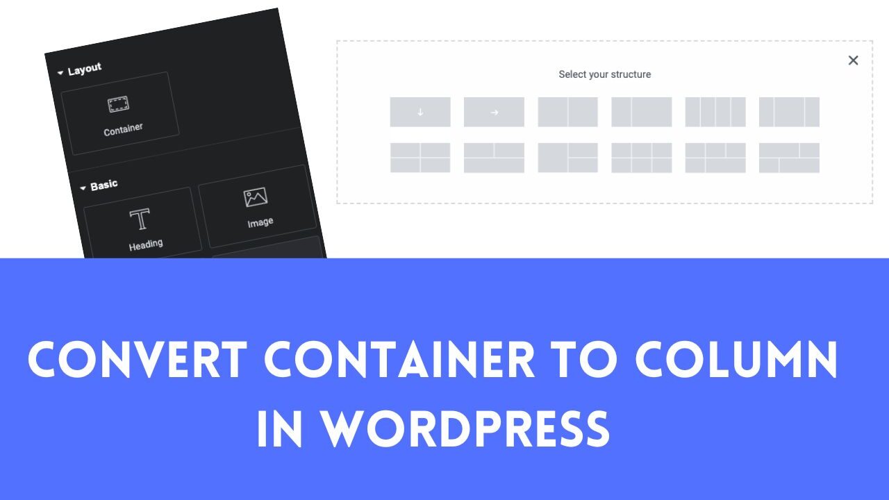
In conclusion, converting from a container to a column layout in WordPress is a creative process that can significantly enhance the visual appeal and organization of your website. By following these steps and considering expert tips, you can transform your website into a visually appealing and user-friendly digital canvas. It’s an exciting journey of creating a beautiful and engaging website that captivates your visitors. So, start your design journey and enjoy the process of creating a stunning online presence. Happy designing!